Today, I continued the work I started yesterday. For a while, I’ve wanted better tooling to explore the different communities that can exist in one network. Community Detection is a well known thing in Social Network Analysis, but with a little Data Science and Software Engineering, you can do much more than DETECT communities and look at them. You can explore them, and you can explore what they are about.
In my book, I often talk about the marriage of Natural Language Processing and Network Science being a powerful combination. Today’s post shows that, and I’ve shows it in previous posts as well. Graphs and DataFrames are useful side-by-side. This isn’t a one or the other thing. Use both.
There’s a few things I want to point out at the start.
I am using a network of 59,260 nodes and 302,588 edges. This is not a little toy network. This is a real-world network, of scientific collaboration on arXiv papers. This is not a toy.
If you visualize a network of 59,260 nodes, you’re not going to see much of anything, especially with Python network visualization libraries. Gradually, there will be more and more powerful network visualization software, but I’m not holding my breath.
If you do Whole Network Analysis (WNA) of 59,260 nodes, it’s going too high level to give you much of anything useful except a list of seemingly important nodes (Centralities and Page Rank).
To chop a large network into pieces, you can use Community Detection to turn a network of 59,260 nodes into a few thousand tiny networks of a few dozen nodes. And each one can be analyzed and explored, separately, quickly, easily.
You can also do more with the community subgraphs. In this post, I use the nodes to easily identify which papers are affiliated with each community.
In short, Community Detection chops up networks into bite-sized pieces so you don’t have to eat a whole whale at once. Learn this.
But the larger goal of the last two days has been to build a way to identify interesting communities. I didn’t want communities with a density of 1.0, as all nodes will be connected to all other nodes in the community. I wanted something a bit more sparse, but not as sparse as a star network. I wanted a tool to be able to explore different communities based on their characteristics of interest. I wanted to be able to play with density values and node counts to see how networks would visualize. So, I built a tool to do that, and I can take this as far as I want.
Get the Code
You can get today’s code here. Follow along with the code to understand how I have done all of this. Essentially, I:
Use bipartite projection to build the author collaboration network
Use the Louvain Method for community detection
Capture context about each community
Visualize each community and show their affiliated papers
How’s It Look?
It looks wonderful. But, before I get into that, I want to show you what you will spend the most time playing with.
min_density = 0.1
max_density = 0.3
max_nodes = 100

communities = fetch_communities(community_context_df, min_density=min_density, max_density=max_density, max_nodes=max_nodes)
I created a function called fetch_communities that takes inputs of min_density, max_density, and max_nodes. If you don’t set max_nodes, it’ll use the total number of nodes in the network as the maximum. Play with the numbers and see what happens! Build intuition! Build intuition! Build intuition!
Before showing pretty pictures, I have a few quick insights, which make sense when you think about it:
Below density of 0.1, you will see sparse communities of authors that do collaborate, but most of the papers have one or only a few authors. This means that there will be more papers, but less collaboration.
Above this, you will see fewer papers, but more authors on them.
At 1.0, you will see fully connected graphs, where every author is connected with every other author in the network. Likely, it’s one paper with a hundred authors, for instance.
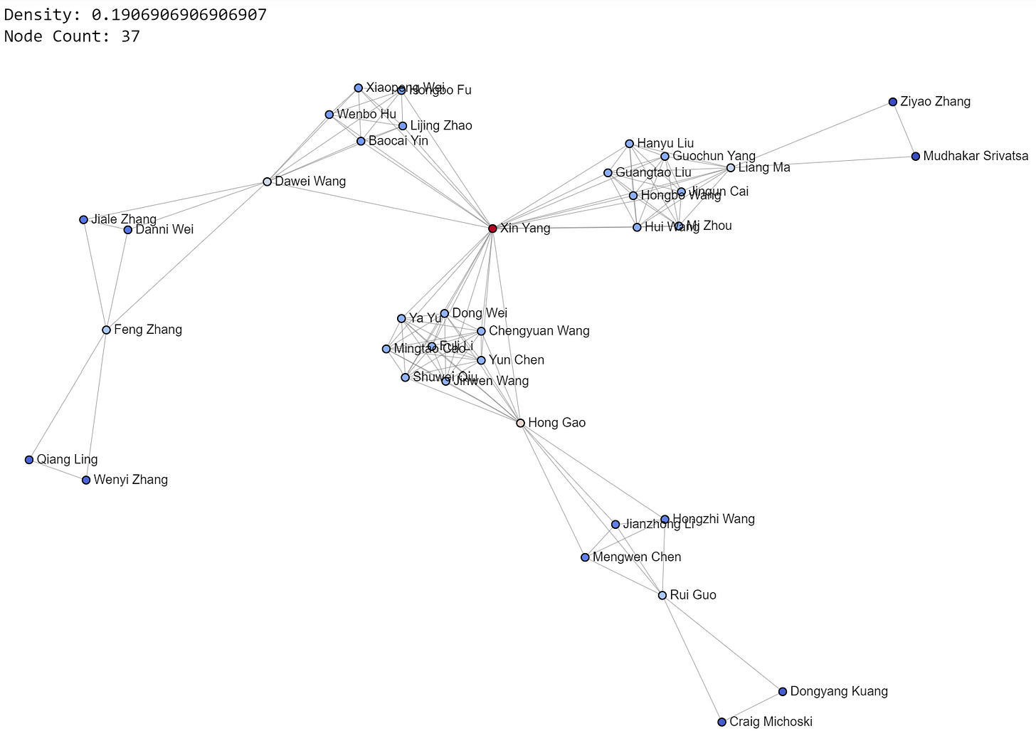
Now, let’s look at pretty pictures. Look at them closely. See what you see. Try to understand. Write down questions to explore. Get inspired. These are mesmerizing, but also a chance to learn and apply this learning in your own life.
Today’s images also provide density values and node counts as additional context, to help you build intuition. I’ll post some of my favorite communities from the 0.2-0.4 density range.
For each community, their papers can be explored:
If you want to explore the papers, check out the code or run the notebook! I’ll show more networks.
I think networks are beautiful. They are also a reflection of life. These are actual arXiv collaborations, not synthetic data. These are life networks. They show how humans interact to accomplish goals, such as writing a research paper.
Network Science, Social Network Analysis, and Natural Language Processing give you the tools to explore reality. This is a network that I am interested in, as the theme of the dataset is Network Science.
A Little Inception Humor
I thought it was pretty funny while doing the analysis when I ran into this paper’s title.
'Online-updated High-order Collaborative Networks for Single Image Deraining'
I found a paper about collaborative networks while analyzing a large collaborative network. I don’t know that I will read that one, but I got a chuckle from it.
Mission Accomplished
The goal was to build a tool to explore the various communities, based on my own domain knowledge about networks. I built just that, and it was very easy. The more you know about Network Science and Data Science, the more flexibility you have. Your limitations are curiosity, imagination, and skill. I can help you with the last one.
That’s All, Folks!
That’s all for today! Thanks for reading! If you would like to learn more about networks and network analysis, please buy a copy of my book!


